Post by Allison Harvard on Apr 30, 2013 21:24:00 GMT -5
Let's see how you sexy ladies did!
Emma

Allison: I like this. I wish you had put an explanation so I knew exactly what I was looking for, but I see it. Japan is known for it's bright, vibrant colors and the props make you look like you're in Japan. I like that you went with a profile for this round, good job!
Twiggy: Excellent job. I really like this, its very high fashion and the photo have an Asian flare to it but I agree with Allison that an explanation would be great but for this photo, it speaks for itself. My only critique is that, your left hand seems dead.
Jared: I love profiles, they're gorgeous. But I don't honestly get the connection. i see the photo behind and the vines and stuff that say Japan to me, but the rest I don't get.
Jensen: the thing i like the most is the window framee because it looks like something youd find in japan
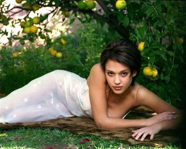
Jessica

Allison: Well done for doing your research and connecting this with the yuzu tree, I had to google it but it's definitely authentic. Aside from that, though, I think the big weakness here is your face. The way it's angled takes away your neck and you look exhausted and bored.
Twiggy: I don't like this. Your pose is weak and strange, you're missing your neck because of the angle of your face and your expression is not to be desired. That clothe itself doesn't do you any good, it seems like you're naked and I can see the "bush". Kudos for doing a research anyway.
Jared: I like this, and thanks for the explanation. Without it, I would be lost. I love the setting, it's great. Your pose is nice. Your lips as always, luscious. You look a bit tired but that's not too bad.
Jensen: i like this it represents japan without taking the focus off of you
Jennifer

Allison: This is not a very good photo, sadly. You have vibrant colors here, kind of, but your wardrobe makes me think of India before Japan, and your face is a mess. I think you missed the mark here
Twiggy: I actually like this a lot particularly your expression, its a strong sad face. To go with the theme of vibrant color itself is very generic, it can be any country apart from Japan, India etc. So I don't have issue with it looking more like India, so to say Allison. Your hair itself, represent Japan very well. They have crazy hair! Nice job.
Jared: Yea I thought India right away myself. But the worst part is your face You look awful. It looks swollen and you look like you went over board on the foundation. And then your hair is limp and greasy looking. Oh darling, this is not good.
Jensen: I wasnt sure if you were holding a rope or a snake til i looked closer. i have to agree this isnt your best photo
Keira

Allison: In terms of thematic connection, this is the best out of anyone. I love the setting and the fashion, I think you hit it. What's week, though, is your pose/face... it bores me. If this had had more energy, it would have been stellar.
Twiggy: I agree with Allison on this, you hit the mark with the theme, your fashion and setting is stellar but you miss the mark with your expression and pose being very generic and boring.
Jared: Your expression is so not generic lol I love the expression. There's more oomph then we're used to from you lately. I hate the outfit, hate it so much lol but the rest of this photo is good. Love the tree and colours. Good job.
Jensen: You hit the theme well and the modeling is good too
Selena

Allison: I just said to Keira that her photo was the best thematically, but I hadn't seen yours yet... this is good! You are such a princess in this photo, very elegant and innocent, I just love everything in here. You make me think of a Geisha.
Selena: This is excellent! I like this a lot. I have nothing bad to say about this photo. I love the setting, expression and the way you look. Bravo!
Jared: WOW!! The profile, the colouring, the softness, the parasol. All brilliant!!! Perfection!!!
Jensen: this is really good i think it represents japan really well
Yoona

Allison: First off, I'm really glad you didn't just go "hey, I'm Korean so I'll post a picture of me in Korea", this was a different angle and I'm very happy you went with it. I had to look up the harajuku style but you're right, it's definitely crazy... crazier than you in this photo, even. I see the theme and it's good, but a little bit more oomph would make this a lot better.
Twiggy: This is really really good! once again, great job Yoona! amazing effort in representing Japan. I like the way you styled, your pose and the fact that you're interacting with the camera! You make me googling more about Harajuku.
Jared: I like that you went with the crazy styles of Japanese culture. That sold it for me. Your eyes are good but your mouth expression seems dead. Nothing there. But the rest is solid.
Jensen: This is good to me theres alot that can still make it better but i like it
Emma

Allison: I like this. I wish you had put an explanation so I knew exactly what I was looking for, but I see it. Japan is known for it's bright, vibrant colors and the props make you look like you're in Japan. I like that you went with a profile for this round, good job!
Twiggy: Excellent job. I really like this, its very high fashion and the photo have an Asian flare to it but I agree with Allison that an explanation would be great but for this photo, it speaks for itself. My only critique is that, your left hand seems dead.
Jared: I love profiles, they're gorgeous. But I don't honestly get the connection. i see the photo behind and the vines and stuff that say Japan to me, but the rest I don't get.
Jensen: the thing i like the most is the window framee because it looks like something youd find in japan
Jessica

Allison: Well done for doing your research and connecting this with the yuzu tree, I had to google it but it's definitely authentic. Aside from that, though, I think the big weakness here is your face. The way it's angled takes away your neck and you look exhausted and bored.
Twiggy: I don't like this. Your pose is weak and strange, you're missing your neck because of the angle of your face and your expression is not to be desired. That clothe itself doesn't do you any good, it seems like you're naked and I can see the "bush". Kudos for doing a research anyway.
Jared: I like this, and thanks for the explanation. Without it, I would be lost. I love the setting, it's great. Your pose is nice. Your lips as always, luscious. You look a bit tired but that's not too bad.
Jensen: i like this it represents japan without taking the focus off of you
Jennifer

Allison: This is not a very good photo, sadly. You have vibrant colors here, kind of, but your wardrobe makes me think of India before Japan, and your face is a mess. I think you missed the mark here
Twiggy: I actually like this a lot particularly your expression, its a strong sad face. To go with the theme of vibrant color itself is very generic, it can be any country apart from Japan, India etc. So I don't have issue with it looking more like India, so to say Allison. Your hair itself, represent Japan very well. They have crazy hair! Nice job.
Jared: Yea I thought India right away myself. But the worst part is your face You look awful. It looks swollen and you look like you went over board on the foundation. And then your hair is limp and greasy looking. Oh darling, this is not good.
Jensen: I wasnt sure if you were holding a rope or a snake til i looked closer. i have to agree this isnt your best photo
Keira

Allison: In terms of thematic connection, this is the best out of anyone. I love the setting and the fashion, I think you hit it. What's week, though, is your pose/face... it bores me. If this had had more energy, it would have been stellar.
Twiggy: I agree with Allison on this, you hit the mark with the theme, your fashion and setting is stellar but you miss the mark with your expression and pose being very generic and boring.
Jared: Your expression is so not generic lol I love the expression. There's more oomph then we're used to from you lately. I hate the outfit, hate it so much lol but the rest of this photo is good. Love the tree and colours. Good job.
Jensen: You hit the theme well and the modeling is good too
Selena

Allison: I just said to Keira that her photo was the best thematically, but I hadn't seen yours yet... this is good! You are such a princess in this photo, very elegant and innocent, I just love everything in here. You make me think of a Geisha.
Selena: This is excellent! I like this a lot. I have nothing bad to say about this photo. I love the setting, expression and the way you look. Bravo!
Jared: WOW!! The profile, the colouring, the softness, the parasol. All brilliant!!! Perfection!!!
Jensen: this is really good i think it represents japan really well
Yoona

Allison: First off, I'm really glad you didn't just go "hey, I'm Korean so I'll post a picture of me in Korea", this was a different angle and I'm very happy you went with it. I had to look up the harajuku style but you're right, it's definitely crazy... crazier than you in this photo, even. I see the theme and it's good, but a little bit more oomph would make this a lot better.
Twiggy: This is really really good! once again, great job Yoona! amazing effort in representing Japan. I like the way you styled, your pose and the fact that you're interacting with the camera! You make me googling more about Harajuku.
Jared: I like that you went with the crazy styles of Japanese culture. That sold it for me. Your eyes are good but your mouth expression seems dead. Nothing there. But the rest is solid.
Jensen: This is good to me theres alot that can still make it better but i like it


