Post by Allison Harvard on Apr 9, 2013 15:12:12 GMT -5
Sorry this round took so long, ladies. Critiques and elims are going up now!
Coureney- Bad Angle/Missing Arm


Jared: I definitely see a correction here. The angle and lighting of the first one are horrible while the angle and lighting of the second one are perfect. I love your connection with the camera and how your makeup is softer and that dress is gorgeous. Your left leg looks odd because of the way your foot is, but that's ok it's minor. Good job.
Twiggy: Its proven here that age is just a number, you're getting better each week and I like how I can see the differences and how you are modelling in the second photo! good job.
Jensen: I have to agree with the other judges on this. I still see a few things that can be worked on but for the most part you were able to stick to the theme and fix what you set out too
Allison: This is my favorite shoot of you so far, and I agree that #2 looks much better. I agree with Jared about your leg, but I am digging your expression. Great job, Courteney!
Emma- Bad Angle/Bad Makeup

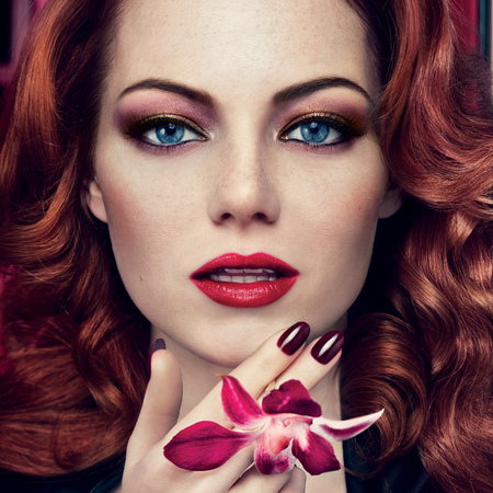
Jared: This is great Emma. While your first one I don't hate, I definitely see the differences and love your new submission. I definitely think another faux pas in your first one is that hair, the styling, in your second one, the styling is fierce and vibrant. Everything in the second picture is more vibrant, and more full of energy. I really love your second photo. I also love that you submitted two photos almost identical in pose and stuff, but have shown extreme differences. This is great. This is the Emma I know and love.
Twiggy: This is amazing Emma! you're the only girl who submitted headshot photos and it worked for you this round. I love the improvements that we can see in the second photo better, you're definitely selling the product be it your eyeliner, eye shadow or lipstick. Nice job!
Allison: This is great! You only corrected a few minor things and it made your photo from crap to perfection. I love your eyes this round, keep it up!
Jensen: This is probably your best Photo so far. I like this a lot.
Jessica- Lifeless Pose/Bad Face
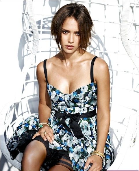
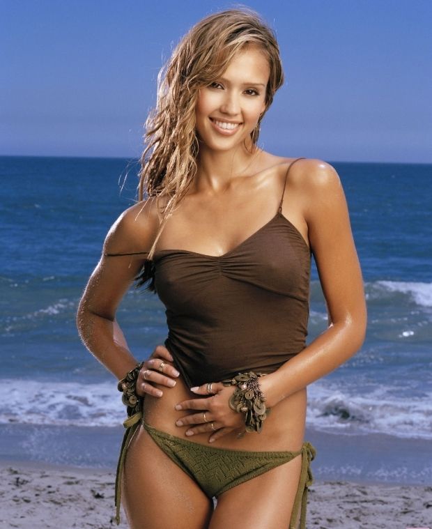
Jared: These are good!!! Your first photo is so lifeless and dull and that outfit also makes you look frumpy and the hair a messy cut. Your second photo is sexy and a great pose and lots of energy coming from your face. And that outfit definitely does NOT make you look frumpy. Very nice.
Twiggy: I can't say that I hate the first photo, really! I like the emotions and feelings that I can sense from your first photo, the only thing I don't like is your posing and the rest is good. I hate how I can see your tit* in the second photo and with the rind and bracelets, you're over accessorize. This pair up is not doing you any good.
Allison: Your first photoshoot is a good one too but you went from good to stellar. You're so tall and beautiful in #2. The one complaint I have is your head position, it looks kind of weird in the second, but overall, great work.
Jensen: These are good it's enough to get ya by but not sure if its enough for FCO
Hyorin- Awkward Hands/Bad Wardrobe


Jared: Your first one is cute and commercial, but you are correct. Too much white and those hands, while they look beautiful, you look like you have to pee. The second one is better. The pose is better and your expression is fierce. There's a definite pop of attitude in your second picture. I also appreciate that you have both on a white background to prove that you learned your lesson from the faux pas with all your colours.
Twiggy: I'm sorry, you keep submitting photos with watermark and its starting to annoys me; its disturbing. To be honest, I like the first photo better. Your second photo looks like you were having a bad night and just woke up from a bad dream. The first photo have a lot more energy than the second one which I think is boring too & I don't like your expression. The only thing I like is the styling.
Allison: I have to agree with Twiggy here, your 2nd photo isn't as good as the first. Part of it is the size, it's really easy to hop onto photobucket and make it smaller. I really have no issues with the watermarks, and I actually like commercial quality of the first better than the 2nd... but I do like that you improved the pose, "I have to pee" isn't really a great direction to take.
Jensen: ?
Jennifer- Awkward Expression


Jared: You definitely got it right, the expressions are totally different. As well as the poses. My issue for you though is there's too much lighting glare in your second photo. And then of course, your photos are both small. Good thing for studio shots, there's nothing else to distract though so the size isnt' going to hurt you.
Twiggy: I can see the differences and I like how fierce you look in the second photo and just like Jared, my issue is with the size of your photo and the first photo is not a modelling shoot. That is more like a post event photo! There's nothing else I like besides your expression in the second photo.
Allison: What I think has already been said. It's not really modelling in the first one, although you look a million times better in the second one. Overall, it's still good though- you are FIERCE in your improvement photo. Just focus on the size and making sure it's really modelling!
Jensen: There are things wrong with this but it's ok
Katy- Bad Quality/No Connection/Awkward Face


Jared: I actually don't agree that the quality is better but the rest is. I love your fierce expression and connection with the camera. I love how your hair is purple in both photos. In your first one I hate the open mouth on that angle, so you've definitely fixed that problem. This is good.
Twiggy: What is wrong with you this round? I'm worried for you. That first photo is more like a screen cap from your music video and its not a still photo and that second photo doesn't do you any favor either and the quality of both photos are poor! this is bad.
Allison: You took this an interesting direction, but I don't like it. You look more model-esque in the second shot, but still... it's a screen cap, so that makes it hard to critique.
Jensen: ?
Keira- No Neck


Jared: I love when you can get into my head because I was so worried you'd choose the wrong photo. I need to stay out of roughs lmfao Not only is there no neck in the first one, everything is a mess. The angle of your head, no make up, no life, no spark, nothing works, it's a mess and then in your second photo, everything is just fucking amazing!!! You're posture, your pose, your expression, your styling, your neck!!! It's all great!
Twiggy: This is amazing! it shows that you're paying attention to what we have to say and improve yourself for the better! Nice job Keira, great work! bravo!
Allison: Ms Keira, this is stellar. You look absolutely AWFUL in the first one, what with the peach fuzz and the non-existent neck, and you perfected everything in shot #2. Great job, my favorite so far!
Jensen: These are Nice. This is the Emily from Last Season Shining through
Reese- Lifeless Eyes/No Makeup/Bad Eyes/Forced Smile


Jared: I definitely like the changes you made. Your smile does seem odd in the first one so I like that you've made it into a bit of smirk in the second one. Your face looks brighter, happier. Flawless skin, beautiful hair. You did very good.
Twiggy: I like that I can see the differences in term of your expression and styling. I however don't think that your first photo is bad either. I like both equally.
Allison: From afar, your first photo is good, but when I look at it closely I kinda hate it. You're emoting in your second photo, you look a lot better and overall it's a much stronger shot.
Jensen: Thought I already judged this. I like the hair in the second shot I don't know if I like how it all works together though
Selena- No Connection to "Halloween" Theme/Connection to Camera


Allison: hahaha your 1st photo is a hot mess. I don't think I need to go into details about how bad that shot is, and I like how you're connecting it to the halloween theme. I have to say that I've never been that big of a fan of that 2nd photo of Selena, as strong as it is. But you are definitely modelling a lot better overall, so good work on fixing your mistakes!
Jared: This is great, a great difference. The first one looks corny and cheesy and the second one looks striking, fierce, great. Good job.
Twiggy: I don't necessarily see the connection between both photos. You're definitely doing a lot better in the second photo anyway and your first is just a mess. This is just okay for me anyway.
Jensen: I think you took an interesting approach with putting a theme inside a theme. And it definitely worked out for you.
Willa- Weak Arms/Plain Fashion/Bad Angle


Jared: Bravo!! The differences here are wonderful. Your expression, hair and pose are so lifeless in that first photo, you look like someone wanted you to do the pose below and you were all "whatever" but then you did the pose in the second and it rocked! Classic model pose, fantastic styling, fierce expression. Good job.
Twiggy: Good job! The only thing I don't like is, in both photo you're looking away from camera. I would love to see a connection with the camera in your second photo which I think would be better! Other than that, I think this is pretty solid.
Allison: This is great, Willa! I actually like how you're posing similar in both of these, with modifications to make it more noticeable and stronger. You look amazing in #2, I absolutely adore the expression, it's fierce as hell, unlike #1, where it looks like your hands got eaten by your waist. Good work!
Jensen: I love this I like the second pose a lot where as the first your just standing there
Yoona- Weak Pose/No Energy/No Sparks


Jared: While I like your styling in the first photo, it's definitely weak and blah. It just drags me down. Then we have your second photo and I'm up and happy. The pose, the styling, the face, the lighting tricks. It's all great.
Twiggy: Awesome job Yoona! I really like this. Everything about the second photo is better than the first one, I don't have anything bad to say. However, I would love to see this pair in colors.
Allison: Your face in #1 scares me, you look close to tears. I like how in your 2nd photo, it's a very similar expression, but you're emoting something and that gives it a lot of improvement. You definitely nailed it this week, great work!
Jensen: I honestly don't see how the second pose is better then the first. They both look about equal to me. I don't like the black and white for the first photo but the second one in black and white makes it stand out
Thank you for being patient, everyone! Eliminations are going up...
now!
Coureney- Bad Angle/Missing Arm


Jared: I definitely see a correction here. The angle and lighting of the first one are horrible while the angle and lighting of the second one are perfect. I love your connection with the camera and how your makeup is softer and that dress is gorgeous. Your left leg looks odd because of the way your foot is, but that's ok it's minor. Good job.
Twiggy: Its proven here that age is just a number, you're getting better each week and I like how I can see the differences and how you are modelling in the second photo! good job.
Jensen: I have to agree with the other judges on this. I still see a few things that can be worked on but for the most part you were able to stick to the theme and fix what you set out too
Allison: This is my favorite shoot of you so far, and I agree that #2 looks much better. I agree with Jared about your leg, but I am digging your expression. Great job, Courteney!
Emma- Bad Angle/Bad Makeup


Jared: This is great Emma. While your first one I don't hate, I definitely see the differences and love your new submission. I definitely think another faux pas in your first one is that hair, the styling, in your second one, the styling is fierce and vibrant. Everything in the second picture is more vibrant, and more full of energy. I really love your second photo. I also love that you submitted two photos almost identical in pose and stuff, but have shown extreme differences. This is great. This is the Emma I know and love.
Twiggy: This is amazing Emma! you're the only girl who submitted headshot photos and it worked for you this round. I love the improvements that we can see in the second photo better, you're definitely selling the product be it your eyeliner, eye shadow or lipstick. Nice job!
Allison: This is great! You only corrected a few minor things and it made your photo from crap to perfection. I love your eyes this round, keep it up!
Jensen: This is probably your best Photo so far. I like this a lot.
Jessica- Lifeless Pose/Bad Face


Jared: These are good!!! Your first photo is so lifeless and dull and that outfit also makes you look frumpy and the hair a messy cut. Your second photo is sexy and a great pose and lots of energy coming from your face. And that outfit definitely does NOT make you look frumpy. Very nice.
Twiggy: I can't say that I hate the first photo, really! I like the emotions and feelings that I can sense from your first photo, the only thing I don't like is your posing and the rest is good. I hate how I can see your tit* in the second photo and with the rind and bracelets, you're over accessorize. This pair up is not doing you any good.
Allison: Your first photoshoot is a good one too
 but you went from good to stellar. You're so tall and beautiful in #2. The one complaint I have is your head position, it looks kind of weird in the second, but overall, great work.
Jensen: These are good it's enough to get ya by but not sure if its enough for FCO
Hyorin- Awkward Hands/Bad Wardrobe


Jared: Your first one is cute and commercial, but you are correct. Too much white and those hands, while they look beautiful, you look like you have to pee. The second one is better. The pose is better and your expression is fierce. There's a definite pop of attitude in your second picture. I also appreciate that you have both on a white background to prove that you learned your lesson from the faux pas with all your colours.
Twiggy: I'm sorry, you keep submitting photos with watermark and its starting to annoys me; its disturbing. To be honest, I like the first photo better. Your second photo looks like you were having a bad night and just woke up from a bad dream. The first photo have a lot more energy than the second one which I think is boring too & I don't like your expression. The only thing I like is the styling.
Allison: I have to agree with Twiggy here, your 2nd photo isn't as good as the first. Part of it is the size, it's really easy to hop onto photobucket and make it smaller. I really have no issues with the watermarks, and I actually like commercial quality of the first better than the 2nd... but I do like that you improved the pose, "I have to pee" isn't really a great direction to take.
Jensen: ?
Jennifer- Awkward Expression


Jared: You definitely got it right, the expressions are totally different. As well as the poses. My issue for you though is there's too much lighting glare in your second photo. And then of course, your photos are both small. Good thing for studio shots, there's nothing else to distract though so the size isnt' going to hurt you.
Twiggy: I can see the differences and I like how fierce you look in the second photo and just like Jared, my issue is with the size of your photo and the first photo is not a modelling shoot. That is more like a post event photo! There's nothing else I like besides your expression in the second photo.
Allison: What I think has already been said. It's not really modelling in the first one, although you look a million times better in the second one. Overall, it's still good though- you are FIERCE in your improvement photo. Just focus on the size and making sure it's really modelling!
Jensen: There are things wrong with this but it's ok
Katy- Bad Quality/No Connection/Awkward Face


Jared: I actually don't agree that the quality is better but the rest is. I love your fierce expression and connection with the camera. I love how your hair is purple in both photos. In your first one I hate the open mouth on that angle, so you've definitely fixed that problem. This is good.
Twiggy: What is wrong with you this round? I'm worried for you. That first photo is more like a screen cap from your music video and its not a still photo and that second photo doesn't do you any favor either and the quality of both photos are poor! this is bad.
Allison: You took this an interesting direction, but I don't like it. You look more model-esque in the second shot, but still... it's a screen cap, so that makes it hard to critique.
Jensen: ?
Keira- No Neck


Jared: I love when you can get into my head because I was so worried you'd choose the wrong photo. I need to stay out of roughs lmfao Not only is there no neck in the first one, everything is a mess. The angle of your head, no make up, no life, no spark, nothing works, it's a mess and then in your second photo, everything is just fucking amazing!!! You're posture, your pose, your expression, your styling, your neck!!! It's all great!
Twiggy: This is amazing! it shows that you're paying attention to what we have to say and improve yourself for the better! Nice job Keira, great work! bravo!
Allison: Ms Keira, this is stellar. You look absolutely AWFUL in the first one, what with the peach fuzz and the non-existent neck, and you perfected everything in shot #2. Great job, my favorite so far!
Jensen: These are Nice. This is the Emily from Last Season Shining through
Reese- Lifeless Eyes/No Makeup/Bad Eyes/Forced Smile


Jared: I definitely like the changes you made. Your smile does seem odd in the first one so I like that you've made it into a bit of smirk in the second one. Your face looks brighter, happier. Flawless skin, beautiful hair. You did very good.
Twiggy: I like that I can see the differences in term of your expression and styling. I however don't think that your first photo is bad either. I like both equally.
Allison: From afar, your first photo is good, but when I look at it closely I kinda hate it. You're emoting in your second photo, you look a lot better and overall it's a much stronger shot.

Jensen: Thought I already judged this. I like the hair in the second shot I don't know if I like how it all works together though
Selena- No Connection to "Halloween" Theme/Connection to Camera


Allison: hahaha your 1st photo is a hot mess. I don't think I need to go into details about how bad that shot is, and I like how you're connecting it to the halloween theme. I have to say that I've never been that big of a fan of that 2nd photo of Selena, as strong as it is. But you are definitely modelling a lot better overall, so good work on fixing your mistakes!
Jared: This is great, a great difference. The first one looks corny and cheesy and the second one looks striking, fierce, great. Good job.
Twiggy: I don't necessarily see the connection between both photos. You're definitely doing a lot better in the second photo anyway and your first is just a mess. This is just okay for me anyway.
Jensen: I think you took an interesting approach with putting a theme inside a theme. And it definitely worked out for you.
Willa- Weak Arms/Plain Fashion/Bad Angle


Jared: Bravo!! The differences here are wonderful. Your expression, hair and pose are so lifeless in that first photo, you look like someone wanted you to do the pose below and you were all "whatever" but then you did the pose in the second and it rocked! Classic model pose, fantastic styling, fierce expression. Good job.
Twiggy: Good job! The only thing I don't like is, in both photo you're looking away from camera. I would love to see a connection with the camera in your second photo which I think would be better! Other than that, I think this is pretty solid.
Allison: This is great, Willa! I actually like how you're posing similar in both of these, with modifications to make it more noticeable and stronger. You look amazing in #2, I absolutely adore the expression, it's fierce as hell, unlike #1, where it looks like your hands got eaten by your waist. Good work!
Jensen: I love this I like the second pose a lot where as the first your just standing there
Yoona- Weak Pose/No Energy/No Sparks


Jared: While I like your styling in the first photo, it's definitely weak and blah. It just drags me down. Then we have your second photo and I'm up and happy. The pose, the styling, the face, the lighting tricks. It's all great.
Twiggy: Awesome job Yoona! I really like this. Everything about the second photo is better than the first one, I don't have anything bad to say. However, I would love to see this pair in colors.
Allison: Your face in #1 scares me, you look close to tears. I like how in your 2nd photo, it's a very similar expression, but you're emoting something and that gives it a lot of improvement. You definitely nailed it this week, great work!
Jensen: I honestly don't see how the second pose is better then the first. They both look about equal to me. I don't like the black and white for the first photo but the second one in black and white makes it stand out
Thank you for being patient, everyone! Eliminations are going up...
now!


